I've often wondered what a surveyor is looking for when peering into the scope at another person standing at some distance with a pole. And Lincoln was a surveyor. ...And the Museum was next door to an interesting new restaurant. So, we stopped by just before lunch.
Originally proposed by Thomas Jefferson, the Public Land Survey System (PLSS) began shortly after the Revolutionary War, when the Federal government needed to survey large areas west of the thirteen original colonies.
 Most PLSS surveys begin at an initial point. The north-south line that runs through the initial point is called the Principal Meridian (above). The east-west line that runs through the initial point is called a base line.
  The PLSS typically divides land into 6-mile-square townships. Townships are subdivided into 36 one-mile-square sections. Sections can be further subdivided into quarter sections, quarter-quarter sections, or irregular government lots.
 I now had a better understanding of the relevance of those marked squares on older maps. And I also understood the derivation of some idiomatic expressions.
 In the Homestead Act of 1862, one quarter-section of land (160 acres) was the amount allocated to each settler.
 "The lower 40" is the 40 acres on a settler's land that is lowest in elevation and the "back forty" is the portion farthest from the settler's dwelling.
But Dora, Kate, and I cut short our tour of the surveyor's instruments and moved into the next room.
What a sight!
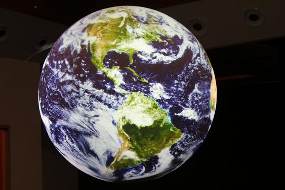 We were greeted by a 68-inch globe hanging from the ceiling and displaying a dynamic image of the earth. The Science on a Sphere exhibit is "a breathtaking, reverse IMAX experience that provides a way to look at the world and universe around us that defies the imagination."
 We joined a presentation by Matthew Parbs to members of a local Rotary.
 The sphere is a large plastic globe onto which four high-speed cameras project images of the earth, the moon, or other planets. The sphere doesn’t move, but the cameras create the illusion that it is rotating on its axis.
 Developed by the National Oceanic and Atmospheric Administra-tion, the sphere has some 250 displays that can be projected onto it, such as this one (above) which shows the number of face-book connections on one recent day around the world.
 Here, the number and intensity of earthquakes around the world on May 24 of this year are shown.
While I'm still trying to just grasp the concept of how the projection of the images work, Matthew pushed a button and the earth changed its rotation to a north-south direction.
Then this image appeared.
 This shows the impact of the recent tsunami that occurred off the coast of Japan. The red lines show the "track" of the strongest impact. Of special interest was the red line near the very top of the sphere, leading to the west coast of the US and to the town of Crescent City, CA.
  The last three photos show hurricanes Katrina (left) on 8/29/05 and Wilma (the two photos below) on 10/21 over the Yucatan Peninsula and 10/24/05 over Florida.
 I was still trying to figure out how to translate the means by which still pictures moving quickly can produce a motion picture on a two-dimensional screen into the means by which images from four projectors can create a three-dimensional motion picture when Matthew mentioned that fifth graders had submitted formatted information to the Museum and then attended a showing of their production.
 This was another example of not allowing enough time to tour a museum. This definitely calls for a return visit and more time to determine just how this exhibit "shows the future of surveying."
A remarkable exhibit
No comments:
Post a Comment